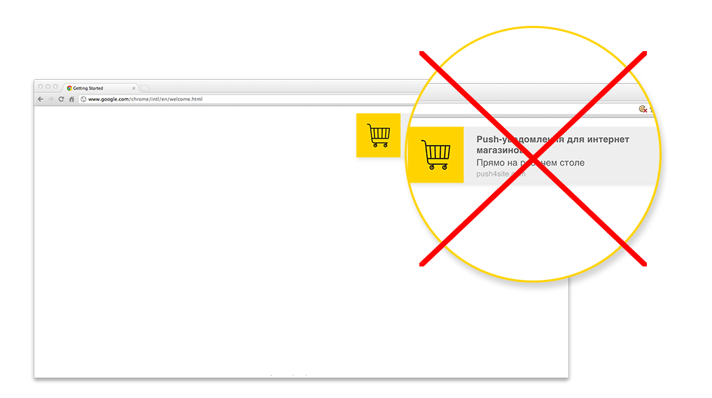
Qualitative notifications are a real way not to irritate your users with an ill-conceived system, because, otherwise, there is a risk of losing access to them forever. Do you need additional motivation for their implementation? Users definitely do not, because it's better to act than just talk about it constantly!
Therefore, Push Notifications are one of the most valuable tools in the marketing world, especially now because they are available on the Internet. But in order to get the most out of them, notifications should be timely, accurate and relevant.
- What is timeliness? - the user receives a notification at the really necessary moment, when he wants it or needs it.
- What is accuracy? - only specific information, which can be used immediately after reception.
- What is the relevance? - only potentially interesting data for the user, which can cause real interest.
- Choosing topics for subscription allows you to implement all these rules very simply, we wrote about this earlier in the article How to send push notifications correctly.
About timeliness
Timely notifications are comparable with the usual prompts, which the user can receive at his own request at the right moment. In this case, timeliness means the convenience for the recipient but not always for you.
It is important to make notifications available, regardless of the device, that's why we support the most browsers and mobile platforms.
Notifications are an effective tool for promoting one or another information, but it is important to take into account the likelihood that they will not be displayed on certain platforms. Therefore, it makes sense to distinguish all important information in a clickable form and then display it in a complete form. If the user needs it, he will be able to view it by using a normal click, regardless of the type of his device, even if he uses standard android mobile phone.
About accuracy
An accurate notification includes specific information about the most important details, which can be identified with a common look. A good example might look like this:

«The flight №1958 has been postponed,
the new departure time at 19:50»
Based on the message, you could immediately understand:
1. Who sent this message (an airline);
2. What has happened (The flight was postponed);
3. And what the sender wants to say (a new time of flight)
It is important to give the user all the information, without having to visit the site.
This may seem inexpedient in some specific cases, but you can understand all the information in Push notifications just by reading it quickly (as the example above). The topic and a brief description play an important role, if it is too "mysterious", the user is likely to ignore it.
Important information should always be located above the rest
When you start reading the text, you always do this from the left to the right and from the top to the bottom, so devices display notifications in the same way! The first line is always the main theme, the second is the essence.
Briefness is a sister of talent, but also of accuracy.
Notification is not an email, because it should be brief. Do not forget that the task is to encourage the user to receive some opportunity and only after personal desire, he may want to visit the site. You do not need to send all the additional information at once - this will only burden the server with unnecessary data.
About relevance
Only potentially interesting data, which can cause real interest, is relevant for the user.
Repetition - it’s bad
During the formation of notification, there is not much space for important information, and you need to save space. If certain data is contained in the title, you do not need to duplicate it in the text, it is better to use free space for other, more important information.
Do not use notifications for advertising
Do not write the site name
The notification already contains the name of your domain.
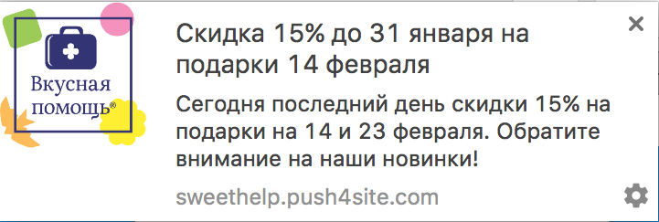
The icon is also part of the message
As a rule, instead of the notification icon, the site or application logo is automatically placed, but this is only done when it is configured. If the user has agreed to receive notifications from you - he will certainly determine the sender by the logo, while the empty icon (standard) will make him additionally reflect on who it has come from.
Please, always make the icon simple and beautiful. Excessive amount of details would overload it, especially because due to the small size the user would not see them at all.
An excellent example of realization!
